How Professional Fonts are Elevating Design with Authority and Clarity
Professional fonts are those typefaces that don’t just look good—they communicate trust, clarity, and polish. They’re used in brand identities, editorial design, corporate reports, UX/UI work, and anywhere the audience expects reliability. These fonts must balance formality with readability, supporting long passages of text, various weights, and multilingual use. In short, a professional font must carry personality without becoming distracting.
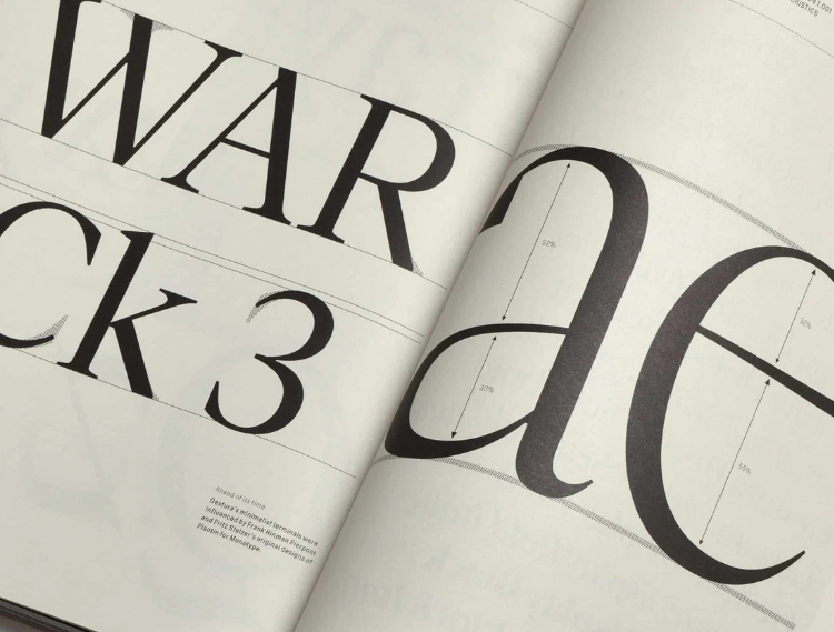
Professional Typeface Design
Modern foundries offer extensive libraries of professional fonts. Many include variable versions so designers can adjust width, weight, and slant. They also come with OpenType feature sets and wide language coverage, making them reliable across projects. These qualities are foundational to professionalism in type design today.
Some of the most popular professional font families illustrate this in practice: TT Norms Pro, TT Commons Pro, TT Fors, TT Firs Neue, TT Hoves Pro, and TT Interphases Pro. These families are frequently updated and trusted by global brands.
See also: From Service to Self-Care: Prioritizing Oral Health in Civilian Life
Characteristics That Make a Font Professional
Versatility and Style Range
Fonts that offer many styles—light, regular, bold, condensed, expanded—allow designers to build typographic hierarchies. For example, TT Norms Pro and TT Commons Pro each include more than one hundred styles. This enables consistency across headings, subheadings, body text, and captions while maintaining the same visual DNA.
Technical Completeness
Professional fonts include large glyph sets, multiple OpenType features, and support for many languages. Regular updates expand these capabilities with new characters, symbols, and improved spacing. This ensures the font remains relevant for global audiences and modern applications.
Clean Design and Readability
Professional fonts often lean toward clean, neutral, or subtly stylized designs rather than highly decorative ones. Geometric sans serifs, neo-grotesques, and slab serifs are popular choices because they offer strong legibility at both small and large sizes. Reliable families also provide trial versions so designers can test readability in real-world contexts.
Brandability and Trust
Thanks to balanced proportions and carefully crafted spacing, professional fonts help projects feel credible. They are often selected by institutions, corporations, and editorial outlets that want to project stability, quality, and modern taste. When paired with strong design, these fonts reinforce a trustworthy brand identity.
Applying Professional Fonts Effectively
Match Mood and Context
Even professional fonts have personality. For a tech brand, a geometric sans serif like TT Norms Pro looks sharp and modern. For a law firm, a restrained serif or slab serif communicates tradition and weight. Matching font personality with brand message is key.
Use Hierarchy
Different weights and widths help create contrast. A bold or semi-bold style grabs attention for headings, while light or regular weights maintain readability in body text. Condensed and expanded widths add further flexibility for poster designs, reports, or web layouts.
Test Legibility
A professional font must work at small sizes, on screens, in print, and across languages. Testing in multiple contexts ensures characters remain clear, spacing feels comfortable, and no important glyphs are missing.
Consider Licensing and Longevity
Commercial projects require clear licensing terms. Professional fonts also benefit from long-term support and updates that improve features and expand glyph sets. This guarantees consistency across time and technology.
Examples of Professional Typeface Families
TT Norms Pro is a geometric sans serif used in a wide range of professional settings. Its large family makes it suitable for everything from corporate branding to digital apps.
TT Commons Pro is a typographic powerhouse that blends clarity with flexibility, making it a strong foundation for identity systems.
TT Firs Neue offers a clean, modern look with subtle warmth, making it a versatile choice for projects that need to balance friendliness with professionalism.
Conclusion
Professional fonts are more than design elements—they are tools that communicate authority, clarity, and trust. The best examples combine style range, technical depth, clean readability, and reliable licensing. They adapt across industries, media, and audiences, ensuring both immediate impact and long-term consistency. Choosing the right professional font elevates design, strengthens brand identity, and leaves a lasting impression.