Color Theory in Branding: How to Choose the Right Palette for Your Business
Color theory in branding is key to building a connection with your audience. The colors you choose to represent your business aren’t just about looking good – they communicate your values, your voice, your message.
Whether you want a bold, energetic look or a calm, trustworthy feel, your color palette plays a huge part in how people perceive your brand, even subconsciously.
In this post, we’ll show you how to use color theory to choose the right palette for your business so you can not only make an impact and stand out in the market, but also immediately communicate your business’ values.
What is Color Theory in Branding?
Color theory, in branding, is about using colors to make your audience feel or react a certain way. It’s about understanding how colors work together and how they affect emotions – think about it as the psychology of colors!
In branding, the colors you choose for your logo, website and marketing materials are a big part of how people see you and how they feel about your business.
If you know a little about color theory, you can make better informed decisions about which colors to choose in order to represent your brand and connect with your audience of choice!
The Psychology of Colors in Branding
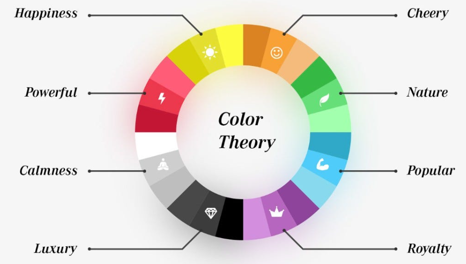
Colors have a strong impact on how people feel, which is why choosing the right ones is important for branding.
Each color can bring out different emotions, ideas, or even memories. Here’s a quick look at what some common colors might mean in branding:
- Red: Energy, passion, excitement;
- Blue: Trust, calmness, security;
- Yellow: Happiness, warmth, optimism;
- Green: Growth, health, nature;
- Black: Power, luxury, elegance;
- White: Simplicity, purity, cleanliness;
- Purple: Creativity, wisdom, luxury.
How to Choose the Right Colors for Your Brand
Choosing the right colors for your brand is a big deal.
The colors you choose will be a big part of how your audience recognizes and remembers your business. Here are some steps to help you decide:
Know Your Audience
Start by thinking about who your audience is.
Are they young and hip, or more mature and corporate? Different colors appeal to different age groups, lifestyles and interests.
For example, if your audience is younger, you might go for bright, fun colors. For a more mature audience, neutral or softer tones might be better.
However, it’s important to remember that these are just guidelines – rules are made to be broken, too!
Match Colors to Your Brand’s Personality
What do you want your brand to say about your business?
If your business is fun and full of energy, red, orange or yellow might work best.
If your brand needs to convey professionalism, reliability or calmness, blue, gray or green can help get that message across.
Consistency is Key
Once you’ve chosen your colors, make sure to use them consistently across all your branding.
This means your logo, website, business cards, social media profiles and any other marketing materials should all stick to the same color palette.
Consistency makes your brand more recognizable and professional. That’s also why choosing your color palette is so important – it’s going to “affect” your company’s entire image down the line, too.
While building your website, remember to incorporate the colours in a specific way.
For example, headings and subheadings will always be a specific shade of blue, and main text will be a specific shade of grey.
Remember to use a VPN when working on your website so your business and personal data are secure.
With a VPN download you can stay protected for a whole year while focusing on building your brand and website.
Color Palettes and What They Represent
Here are a few popular color palettes and what they might mean in different industries:
- Warm Palettes: Red, Orange, Yellow – these colors are energetic, exciting and enthusiastic. Brands in the entertainment, food or fashion industries use them to stand out and get noticed.
- Cool Palettes: Blue, Green, Purple – Cool colors are calming and trustworthy. They’re used in industries like healthcare, tech, and finance because they feel reliable and peaceful.
- Neutral Palettes: Black, White, Gray – Neutral colors are classic and timeless. Brands that want to look clean and sophisticated often choose these palettes, especially in luxury, tech or modern lifestyle brands.
- Mixed Palettes: Bold and Neutral Combinations – Many brands combine bold colors like red or yellow with neutral tones like black or white to balance it out. This way brands look exciting, modern and professional and appeal to everyone.
Mistakes to Avoid When Choosing Brand Colors
Be careful not to do colors the wrong way though! Colors are fun and creative, but there are still a few things you should keep in mind.
1. Going Too Crazy With All The Colors
Too many colors can make your brand look messy and confusing, so stick to 2-3 main colors for your brand.
It could potentially visually overwhelm your audience, render your main message almost invisible, or just make your brand seem messy and disorganized.
2. Poor Contrast
Make sure there’s enough contrast between your background and text colors so everything is readable.
Low contrast can make your website or marketing materials hard to navigate, and could lose customers.
3. Colors That Don’t Match Your Brand Message
It’s easy to choose colors you like, but that might not be right for your brand or the emotions you want to invoke in your customers.
Make sure the colors you choose match the feeling or personality you want your business to convey – if your brand is meant to be friendly and playful, dark, heavy colors might not be the best fit!
4. Relying on Trends Too Much
Choosing your brand’s colors should be based on your personality, goals, message, and values. Sure, using trends as inspiration and loose guidelines is fine, but following them to a T is no good.
Remember: trends come and go. Make sure your brand uses colors that will stand the test of time so it doesn’t look dated when the trend passes.
Conclusion
Color theory has been a big part of building my own business – choosing the right colors helped me create a brand that connects with my audience and yet also reflects what I want my business to be all about.
By understanding how colors affect emotions, I was able to choose a palette that matches my business personality and my customers.